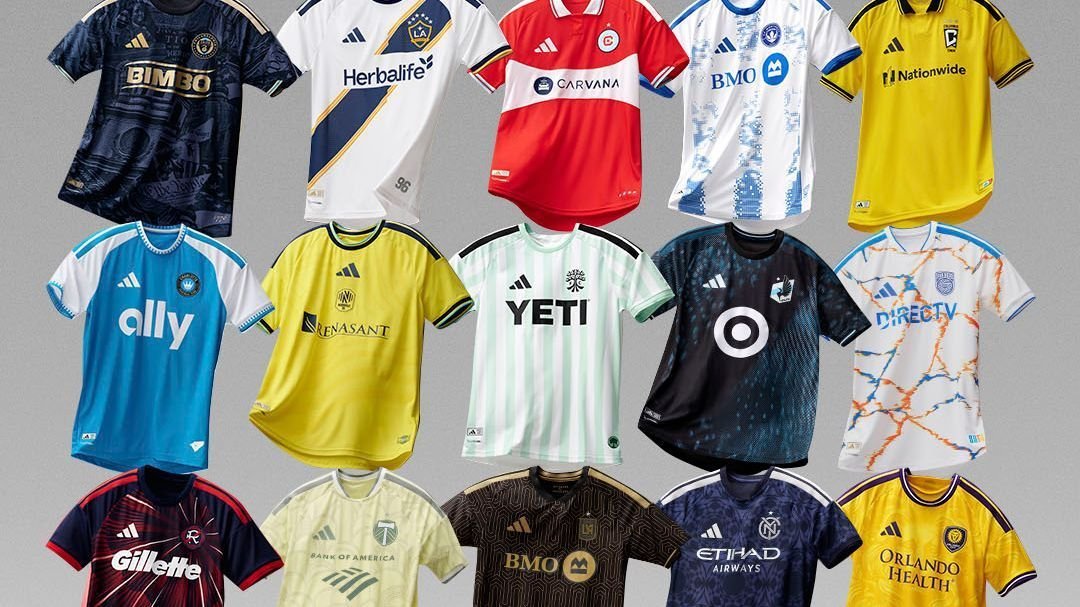
Another season of MLS is on tap, which means all 30 teams will have a new kit from Adidas. The days of templates overrunning the league and stifling design are gone (at least for now), and each club has gotten a bespoke design that has delivered an array of looks across the two countries.
While some teams are really stretching the inspiration for these kits — and who can blame them, having to come up with a new one each year and pretend they have some deep, local meaning when sometimes they just did something they thought looked cool — others have found some truly delightful wells from which to draw from. And in the end, it’s really just about whether it’s a good look anyway.
So which kits are a hit, and which clubs missed? As each club unveils its new uni, we’ll rank ’em!
Hello, 1996, it’s great to see you again! The team that has rightly clung to its name from MLS’s inaugural season now has a kit that looks like it belongs in the outrageous and distinctive years of the league’s founding, and that is wonderful.
The team claims that it’s paying homage to the country’s founding in 1776 and this being the 250th anniversary of the United States, but this is the New England Revolution. They are the MS Paint crest. They are the militia shooting muskets after goals. They are the team who most exemplifies the year MLS was born and American soccer changed forever. And this kit, with its red, white and blue starburst design, is that.

LAFC has gone back and forth between trying to make black and gold stand alone, which is mostly underwhelming, and leaning into the art deco vibe of their brand, which is gorgeous. They went with the latter this time around, and it’s one of the best kits they’ve ever had.
This is how you go bold, while grounding your design in the elements that have been part of your identity from the jump and stand out from anyone else in the league. This is beautiful, rooted in Los Angeles and screams LAFC. It’s perfect.

The Grateful Dead might be primarily associated with San Francisco, but they were formed just up the road from San Jose in Palo Alto, and this is a terrific kit that pays homage to that iconic Bay Area band. The tie-dye design is unusual on a soccer shirt, but it doesn’t look ridiculous or perverse, and the Quakes’ blue and black, on a white jersey, makes sure that it still feels like it represents the club. It’s wonderful, and maybe next year San Jose will try a Scarlet Begonias kit to round out the set.

Montréal says this kit is inspired by the threads worn by the 2015 squad, which is a team worth remembering. After all, that Impact side made the Concacaf Champions League final and bested Toronto in the MLS Cup playoffs.
This kit looks nothing like the jersey that team wore, but it still looks good, and the club partnered with ProCure in the fight against prostate cancer with this kit. Good design, good team, good inspiration, however tenuous the latter might be. That’s a good kit.

NYCFC have struggled to find the right secondary shirt. Their home kit looks like every other City Football Group club, which puts pressure on them to make their other look distinctive and uniquely theirs. That has led them to garish and bold and forgettable black, but this one really nails it for the first time.
It’s an understated shirt — the navy is hardly groundbreaking, but the design is gorgeous and won’t be confused for another club anywhere in the world, while the silver stripes and sponsor fit in excellently. Throw in the minimalist crest and the Pigeons are going to look fly.

The Loons are celebrating 10 years in MLS with a bit of a nod to their inaugural threads. Whereas that first MNUFC jersey had a blue sash, this one has blue design marks that are absent across the front of the shirt, creating a subtle sash using negative space.
It’s a good design, and it’s nice to see them return to the black-and-blue sky motif that was such a hit in their previous northern lights kit. If they keep coming back to this, you’ll be hard pressed to find anyone complain.

It’s always tough for teams who wear white at home to find interesting looks, but the Galaxy’s sash gives them something unique and identifiable. Whenever they lean into the sash, they’re doing a good job, even if the break for the sponsor is a bummer, but the six stars help balance that out.

Orlando has never really tested new colors in its kits. The Lions wear purple on their primary shirt, and their secondary kits have been either white or a pale purple, so going with this yellowish gold is a huge pivot for the club and a terrific move. It’s bright and bold without straying too far from their identity as the purple accents make sure you know this is Orlando City. It also just feels warm and, well, Florida.

San Diego got saddled with the expansion season plain kit last year, so it’s nice to see the club get a design — heck, any design — on this one. Because its crest is so lackluster, there was little indication where it would go with its fits, and the club decided to stick with white. It’s hardly exciting, and it’s still not clear what SDFC’s visual identity is, but the extensive blue and orange make the shirt pop and at least feels like something bespoke instead of off-the-rack like in 2025.

Austin is matching vertical stripes on its primary and secondary kits for the first time, and with both shirts being green, it could be a little redundant, but this jersey is different enough that they’re going to make for a nice pairing.
The pale green and white go together nicely, and the black stripes, logos and sponsor make sure the kit isn’t too subtle and forgettable. Overall, it works, and it complements the home shirt without feeling like simply a color-swap version of it.

Chicago’s disastrous and abandoned rebrand is still seared into our minds, so any time the club returns to its roots, it’s a big win. Red with a white band across the middle gets the job done. Add in a collar, which has a nice red stripe on it, and a blue sponsor across the front … and it’s taking care of the details, too.
The Fire have a bright future, with their own stadium set to break ground later this year, but it needs to be grounded in the club’s history. This kit does that.

This isn’t the Red Bulls’ best design, and the premise behind the roots meant to symbolize the club’s growth is pretty stretched, which means that in a vacuum, this kit would be a lot lower. However, we’re giving credit whenever the club goes with MetroStars’ black and red over the Red Bull conglomerate’s white, red and blue. This kit feels like it represents the club, not the energy drink brand, and so it’s easy to overlook some other things.

Can you believe it’s already Charlotte’s fifth MLS season? The club is going back to basics with this one, using blue on the body and white sleeves, as it did in its first two years, and it’s a smart move. The Crown have a distinct color, and the white sleeves really help it pop. They could probably try for a hint of black in the trim somewhere, just to bring their whole color palette into the design, but this is a club that is better suited to a home kit that lets their color shine and this, like their inaugural fit, does just that.

Remember when the Crew tried to make black their primary color and put yellow on the back burner? Thank god those days are over. This kit is simple, but simply yellow is more than enough for Columbus, and the collar is a nice throwback to the early 2000s when it was a staple on the Crew shirts.

Any time the Union don’t have a vertical stripe, preferably down the center, they’ve failed. This isn’t a bad design, and the navy and gold is sharp, but it’s uninspired. If they’re going to keep trying to pull on Ben Franklin and the constitutional convention, then they’re going to have to create better, clearer and consistent marks that they can own instead of just putting “We The People” at random when they don’t have an idea of their own.
More than anything, though, it doesn’t have a vertical stripe.

Nashville has made it clear in its short existence that it doesn’t want to get particularly creative with its home kits. The club’s aesthetic is going to be yellow, and that’s fine.
That said, NSC don’t have to stack the Adidas logo and crest in the center right above the sponsor logo, too. That’s adding clunky design to a kit that was never going to wow anyone anyway. The best thing about this jersey is that Nashville Predator and Nashville SC part-owner Filip Forsberg leaked it when he wore it to a game last week.

The idea for this kit is great. It’s meant to celebrate the 100th anniversary of Providence Park, a stadium that defines this club arguably more than any home ground does its MLS team, but it just doesn’t come off well.
Instead of looking like the worn exterior of the hallowed old venue with ivy crawling across it, it looks like a nondistinct pale yellow and, without explanation, it would be hard to figure out what it’s meant to evoke. It’s a shame the execution didn’t match the idea.
