New NWSL season, new kits to rank!
The 2026 campaign kicks off on March 13, but the competition off the field starts now as we pick the best and worst of the new primary, secondary and third kits.
Each of the league’s teams has unveiled at least one new kit for 2026, while Boston Legacy and Denver Summit launch this season, adding two kits each to the mix.
Certain teams chose to blend fashion, art and soccer to create standouts, while others opted for simplicity and cleanliness to assert their dominance. Some looks pop, yet others are, well, pretty boring. While taste is subjective, we’re going to rank all 18 of them!
– How to watch ‘NWSL: The Final Third’ on ESPN
– Stream LIVE NWSL matches on ESPN+ (U.S.)
I understand what Boston was trying to do here with its “Common Ground Kit” in honoring each neighborhood that surrounds its stadium in a message of unity. But the design is almost too distracting to allow one to care about the message. Additionally, with no recognizable emblem from any neighborhood stamped on the patches, that message simply does not come across.
With a color palette reminiscent of the 1990s, which feels more dated than intentionally retro, this one earns last place in this year’s NWSL kit rankings.

This is an underwhelming attempt by Denver Summit, especially for a team that resides in such a picturesque state as Colorado. The jersey is simple and clean but uninspiring. With so much inspiration to choose from in Denver, from its snowy mountain peaks to its beautiful red rocks, the design team could’ve taken more risks for the secondary kit.
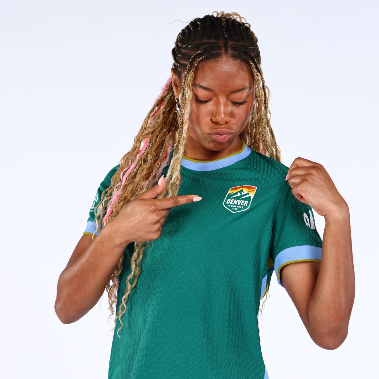
This Denver jersey ranks higher simply because you would expect a primary kit to look plain and classic. Dubbed the “Inaugural Evergreen Kit,” its shade of green is nice, and the club says it’s meant to reflect the pine forests of Colorado’s Front Range.
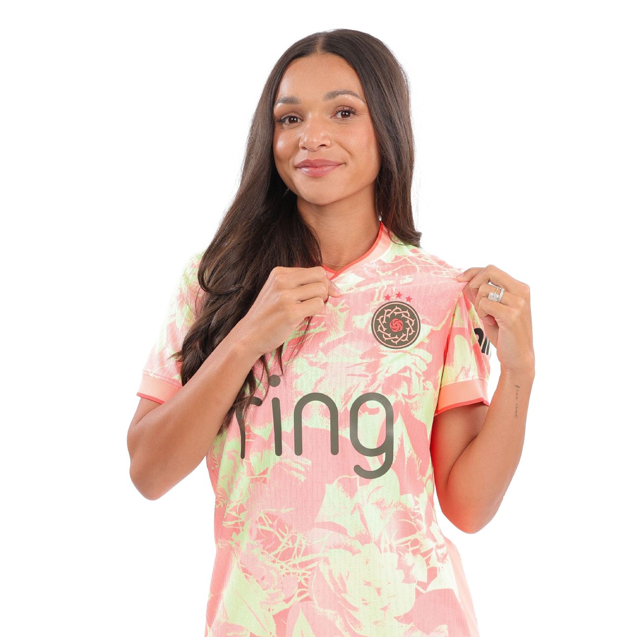
15. Bay FC third kit
Bay FC’s “Poppy Kit” lives up to its namesake, but it needed more of the stark contrast between red and black that the flower is so famously known for. One can certainly appreciate the effort put into the jersey as a whole, but it needed a bit more to truly shine.
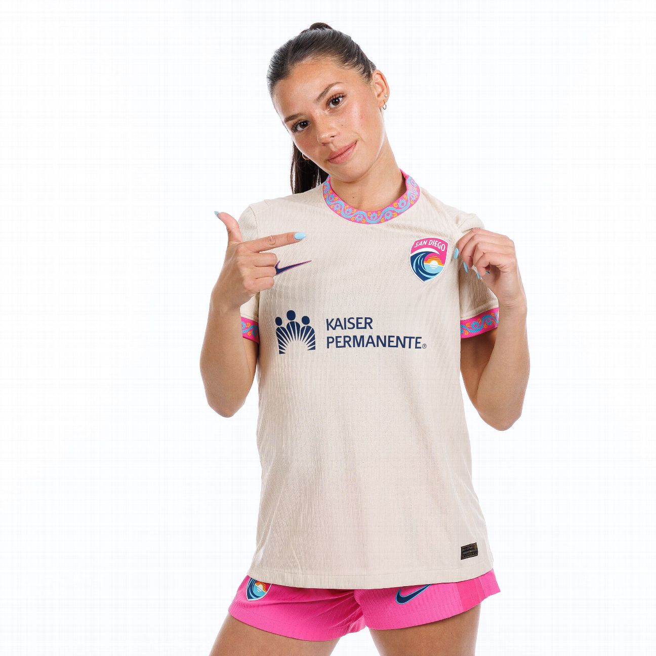
Previous editions of San Diego Wave kits ultimately left the bar too high for the “Balboa Park Kit.” The details on the sleeves and collar are intriguing and would’ve made the jersey much more exciting if done throughout.
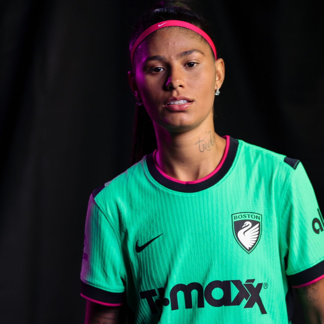
This kit is poised to stand out on the pitch simply by going all-in on Boston’s green, a color that no other NWSL team features. There might not be much to it, but the kit works as a foundation to build upon in the future.
Named the “First Light Kit” as a nod to an opening season, it does well to introduce the Legacy to the NWSL in a clean fashion.
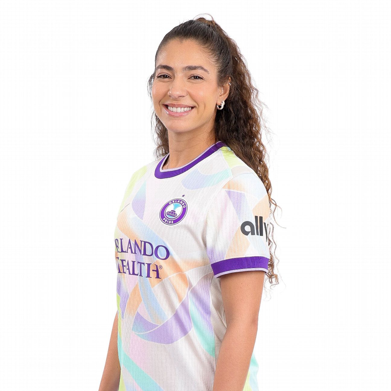
Like the Wave, I expected more from the Orlando Pride.
Previous jerseys by the team have done such a phenomenal job at standing out on and off the field, but this secondary kit oddly blends in. Named the “Unity Kit,” it is missing its usual punch that does so well to capture the team’s energy.
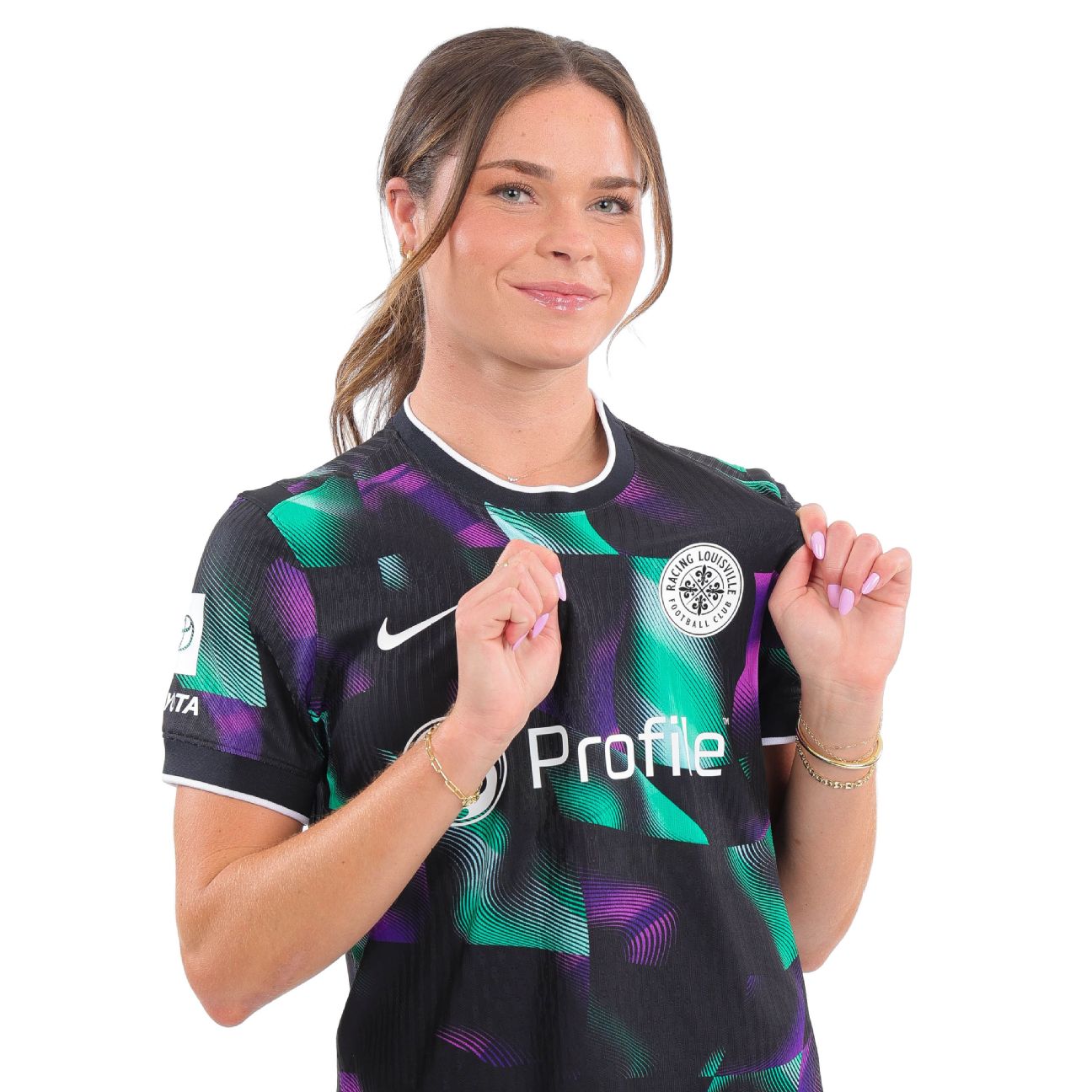
Taking risks with jerseys doesn’t always work, but one can certainly applaud the team for trying instead of falling victim to oversimplicity.
The so-called “Disco Kit” definitely pays homage to its name with its funky alternating purple-and-green motif.

Let’s break into the top 10 with a worthy candidate: the Reign’s “Surge Kit.” The two tones of blue stand out while also blending perfectly with the team logo.
The club says the design “represents legacy in motion” — while that might be a stretch, it is reminiscent of waves that are fitting for the coastal city.
This jersey, with the rose and thorn patterns blended into the background, could’ve easily cracked the top five in previous years. Unfortunately for the Thorns and fortunately for fans of the league, however, the competition was fierce in 2026.
The kit is called “Electric Bloom,” and it’s easy to see why with the highlighter-yellow accents added to the Thorns’ usual red. As a primary kit, it stands out for going beyond basic.
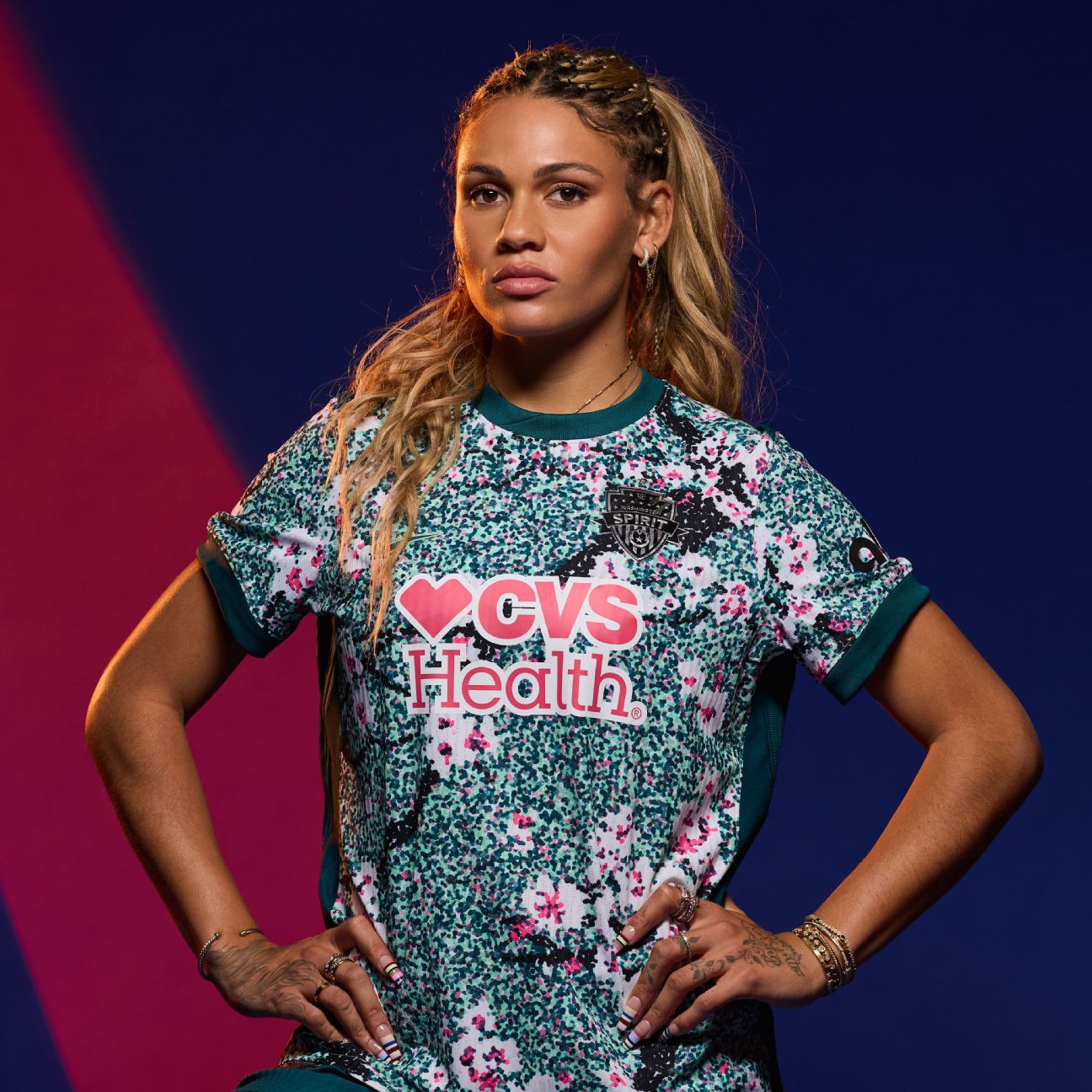
Cherry blossoms, in theory, work well to represent one of the most beautiful moments of spring in Washington, D.C., as shades of pink take over the trees and sidewalks. But unfortunately, no D.C. sports team has been able to nail the concept of the cherry blossom well and, despite landing in the top half of this list, that very much includes the Spirit.
The team’s attempt is noble, but the shade of green overshadows the subtle pink and white shades of the actual flower. It gets an A for effort but a disappointing B- for execution.
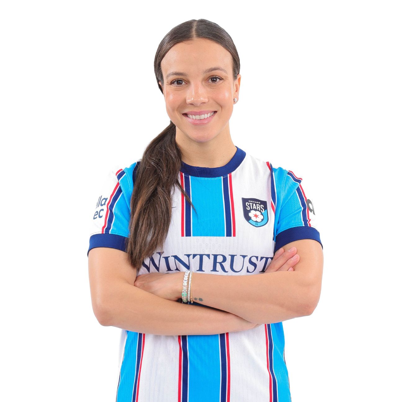
A well-done execution of a classic soccer shirt. As a primary kit, the Stars did a perfect job in not overly complicating the design to a point where brand recognition is completely lost.
The color palette reflects the emblem (and thus, the flag for the city), making it instantly recognizable as a Chicago jersey. The kit is also just neutral enough to fall into the “blokecore” trend of using a jersey casually in the name of fashion.

Art meets soccer in the Courage’s “Become Kit.” The design and color palette work perfectly together to present a new style of soccer jersey, all while not betraying the team’s brand and identity.
The design element is a Venus flytrap, which the club notes is indigenous to North Carolina and recognized as the state’s official carnivorous plant.
For a team that continuously releases interesting kits, this year’s so-called “Storm Kit” did not disappoint in the slightest.
Like with many third kits this year, the only disappointing aspect is that fans will not be able to constantly enjoy the design on the pitch. Let this serve as a formal petition to the Current to make this the secondary kit instead.
Here’s another club that knows how to use its colors to constantly impress. The way this jersey’s design leads the eye to the crest in a dynamic way is stunning, highlighting the well-executed crest that fans know and love.
Dubbed the “Flare Kit,” the club calls the design motif a “sol rosa sunburst.” It’s another hit by the club, even when expectations were sky high after 2025’s kit release.
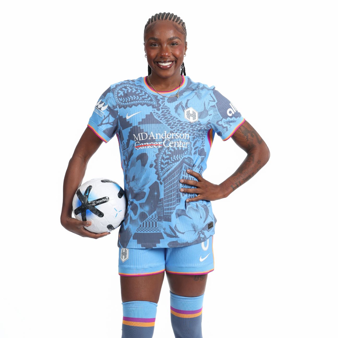
Called the “Houston Chronicles” kits, this is what I believe the Boston Legacy attempted to do with their secondary kit. This does a good job in highlighting different aspects of city culture while cohesively blending the concept under two tones of blue.
It stands out but doesn’t distract. Why is it the third kit and not the second? This, too, deserves to be on the field as often as possible.
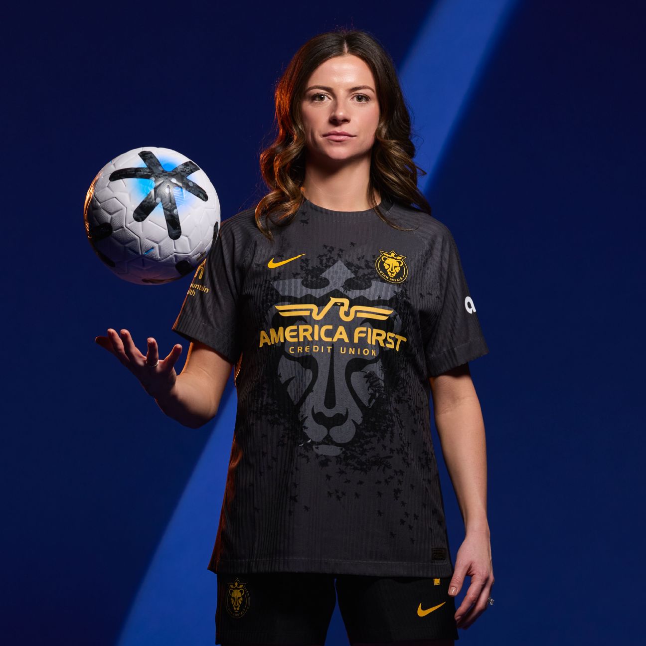
Simple yet cool. The only way to perfect this jersey would be to somehow move the sponsor out of the way of the lioness and turn it into the primary kit. The bees swarming the lioness, like its name the “Swarm Kit,” adds a nice touch to differentiate the jersey from other feline counterparts.
This deserves to be showcased on the field on multiple occasions, with the sun shining on each player when taking the squad photo before the game.
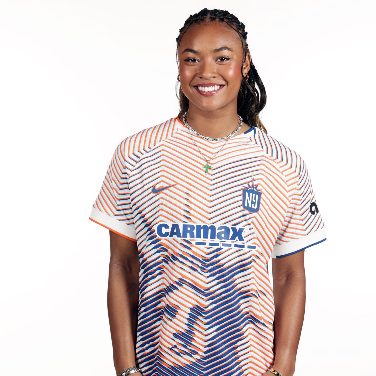
A cliché, revolutionized. Gotham took an iconic New York monument and blended the idea with a unique design concept to present a somewhat fresh approach. The result? A new look for the famous statue we’ve all seen.
It’s perfect as a third kit: different enough to work while also tying into the team’s identity.
Also, yes, I understand the jersey reflects the New York City flag colors, but it’s a nice bonus for Gotham fans who also choose to support the Mets and/or the Knicks.