Adidas has gone ahead and released a swathe of international away kits, many of which will be gracing the grandest stage of all when the 2026 World Cup kicks off in a few months’ time.
The headline is that the classic trefoil logo is back with Adidas’ much-loved three-pronged emblem now set to appear on shirts at a World Cup for the first time in 36 years, since the likes of France, Argentina and champions Germany all wore it with a flourish.
The same retro essence runs through this latest batch of World Cup attire, with Adidas continuing the stylish run of form it has cultivated by applying its trefoil to a number of club kits in recent years, including a series of beautiful third jerseys for Real Madrid, Liverpool, Manchester United, Bayern Munich, Juventus and Arsenal (among others) that were released for the 2025-26 season.
As many of football’s fashionistas have noted, adding the trefoil to a shirt is basically tantamount to a cheat code for Adidas, which seemingly can’t fail when it comes to honing these retro-infused beauties, all of which hark back to the heady days of the 1970s, ’80s and ’90s.
So, let’s get to it.
Here we take a closer look at the 25 away kits released Friday. We have sorted by nations who have already qualified for the World Cup, nations still hoping to qualify via the playoffs and lastly those nations who have fallen short of making it to the finals in the United States, Mexico and Canada this summer.
– Ranked: Every USMNT World Cup kit from 1990 to 2026
– Brazil’s stunning away kit to be Jordan’s first at World Cup
– Puma 2026 World Cup jerseys rated: Ronaldo’s Portugal and more
A relatively simple look for the Fennecs sees them foisted with a two-tone green design that is apparently inspired by the rocky deserts of Algeria, as well as the national colors of green, red and white. The collar is an unusual mini-V gusset design, but other than that it’s a tad bland.
Rating: 6/10
Adidas
One of the more garish Argentina away kits in recent memory, the black shirt is covered all over in a swirl of foliage picked out in various lighter blue hues. The cascading fronds on the shirt are actually an homage to the renowned Fileteado Porteño folk art style that can be found adorning almost everything in Buenos Aires — from buildings to buses to bicycles. The result is undeniably gaudy but we imagine some will appreciate its unique charm.
Rating: 7/10
Lovely stuff from the Belgians here who have concocted a retro-infused abstract away shirt that is almost certain to please the kit hipsters among us. Stealing the limelight from the trefoil logo and minimal black trim is an all-over graphic in pastel pink and blue inspired by both the national federation crest and surrealist artist René Magritte. The Magritte influence is further evident in a quote printed beneath the back of the collar that reads, “Ceci n’est pas un maillot” (“This is not a jersey”), which is a reference to Magritte’s 1929 painting “The Treachery of Images.” One quick Google search will reveal why.
Rating: 7.5/10
 Chile (Failed to qualify)
The beige, earthy base is covered in a crackle graphic that then has pockets of little pink flowers scattered across the entire shirt. As if it wasn’t already obvious, the design is inspired by the so-called “desert bloom” (“desierto florido“) of the Atacama, where once in a while the arid landscape bursts into a riot of color thanks to the sudden emergence of swaths of flowers and blossoms. It’s like a geography lesson in football shirt form, and we very much enjoy that. It’s just a shame we won’t be seeing it at the World Cup.
Rating: 7/10
Adidas
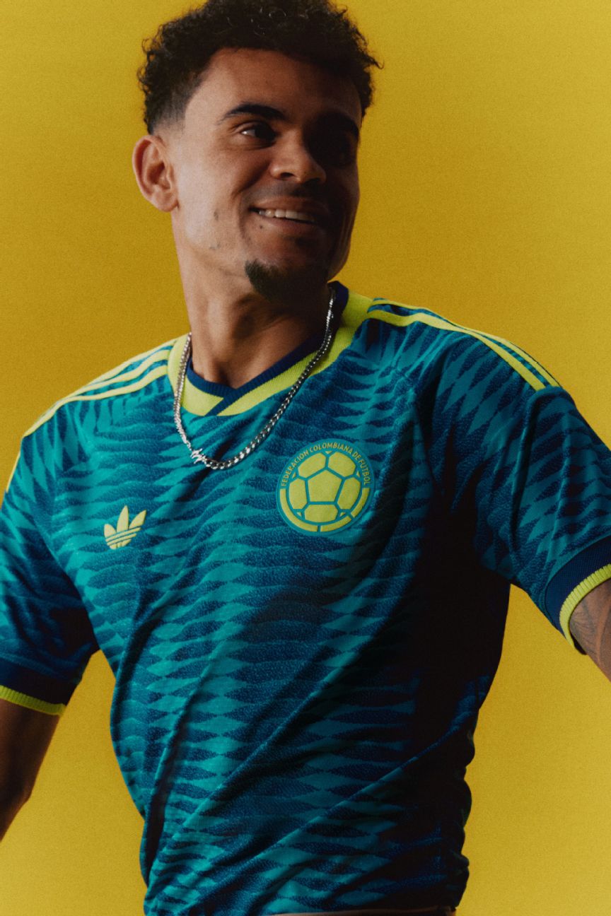
No strangers to a nifty away kit, Colombia have knocked up another solid effort for 2026 with a funky retro design. The color palette consists of an ultramarine blue pattern made up of wavy columns of lozenges that appear to make the design shimmer like fish scales. A contemporary citrus zing is then added via the lemony yellow trim to create what is essentially a rather tasty seafood dish.
Rating: 6.5/10
Pastel pinks and blues are used to create a unique graphic inspired by the Costa Rican jungle flora and fauna, and in particular the toucan, which lives among the rainforests. It’s lush and colorful but a little too similar to the Belgium shirt for our liking.
Rating: 6/10
The Curacao away kit is an homage to the Caribbean island’s capital city of Willemstad and the colorful Dutch-style buildings that line the waterways in the Punda and Otrobanda districts. The pastel yellow shirt is livened up with a dash of pink, turquoise and orange here and there to create a wonderful, dreamy sunset feel.
Rating: 8/10
Adidas
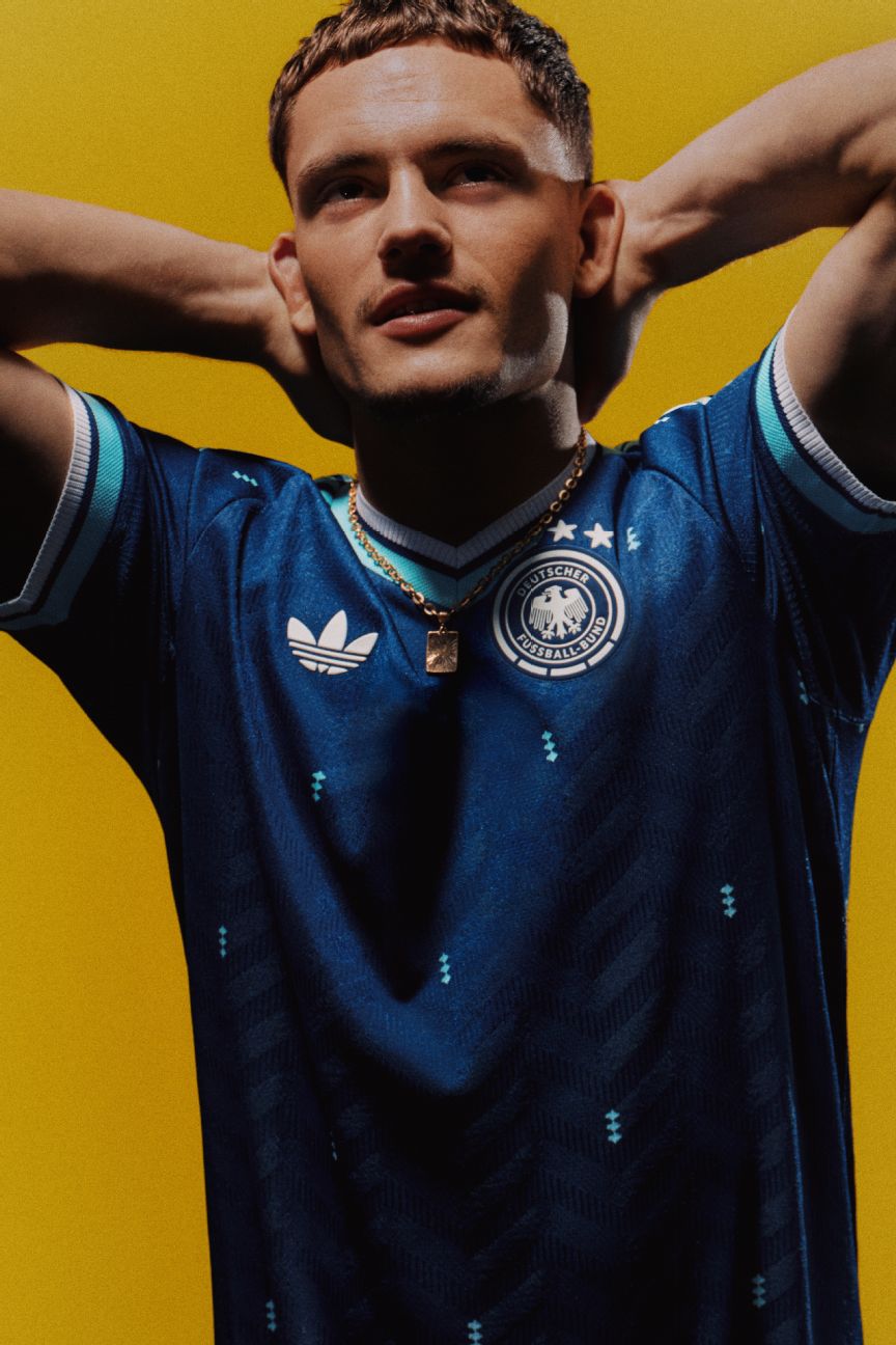
This is the final away shirt to be produced for Germany by Adidas before Nike takes the reins from 2027 onward, and the result is arguably a little underwhelming. It’s prim and proper enough, but the basic dark blue and mint design smacks of a prematch warmup shirt rather than a main attraction of any kind. It’s very much in the “OK” bracket, but we feel the trefoil is doing a lot of heavy lifting here.
Rating: 6.5/10
As always, the Greece away shirt is a direct color swap of the home kit, and as such consists of a plain blue shirt with white trim. There’s nothing to get excited about here, but the back of the collar does boast a smidgen of extra detailing with the application of some Hellenic script that apparently references the year the Greek Football Federation was founded.
Rating: 5/10
Sometimes we wonder why Hungary bother to release new international kits every year, and 2026 is no different. The home kit is red with green and white trim, and the away kit just another straightforward color rotation. The trefoil adds a classic air to proceedings, but the truth is that the Magyar’s “new” away kit is almost entirely indistinguishable from the majority of previous efforts.
Rating: 5/10
 Italy (Playoffs)
Adidas
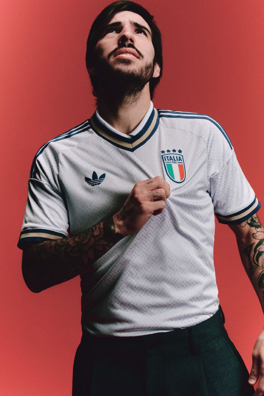
Hardly a world-beater and hardly set to go down in the annals of great Italy kits, but the Azzurri‘s new away shirt is at least somewhat elevated by the subtle pattern found in the material. The interlocking herringbone is said to be based on a style used in traditional Italian tailoring that has been worn by the national team (once suited and booted) during their great triumphs of the past. All very chic, but alas, a little bit forgettable.
Rating: 6/10
Designed in collaboration with the Bob Marley Foundation, both of Jamaica’s World Cup kits are festooned in red, green and gold, and contain visual references to the reggae icon and his music. The away kit is predominantly black with a line pattern inspired by rocksteady soundwaves and doodles of old cassette tapes.
Rating: 7/10
Adidas
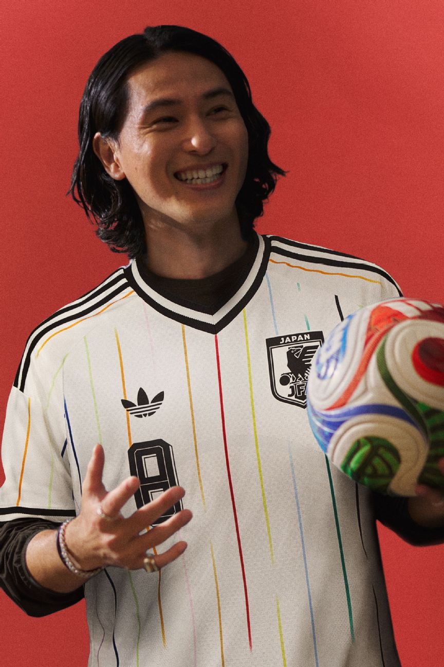
As close to a surefire hit as you’re likely to get, Japan’s away kit is incredibly fresh with an off-white shirt and brightly colored rainbow pinstripes that takes more than a few pointers from traditional baseball jersey design. Each of the 11 color stripes represents the players on the pitch, and the central red stripe signifies the Japanese football family. It’s gorgeous and is almost guaranteed to sell out immediately. Mark our words.
Rating: 9/10
It’s not a patch on the nostalgia-laden 2026 home kit that was released last year, but the Mexico away shirt is clean and cool with minimal tricolor trim and a faint zigzag fabric pattern inspired by Mesoamerican architecture, such as the ancient Mayan ruins at Palenque.
Rating: 7.5/10
Arguably among the least visually stimulating of the Adidas trefoil away kit batch, Northern Ireland’s shirt is white with green trim. Indeed, the only extra flourish comes in the form of the minty pinstripes that are wound diagonally around the torso.
Rating: 5.5/10
Another shirt that is likely to go down well with the hipsters, Peru’s away kit is built on a plain black base but the simple neon pink, orange and yellow detailing (inspired by the “Chicha” pop art style) and the three-colored trefoil are almost certain to earn it cult status among shirt aficionados despite La Rojiblanca‘s failure to qualify for the World Cup.
Rating: 7.5/10
Essentially just a plain white T-shirt with bog standard maroon trim, there is almost nothing of note to add when it comes to Qatar’s World Cup attire despite it supposedly being inspired by the Arabic nation’s sweeping desert dunes. The Arabic word for Qatar (قطر) is printed on the back of the neck, but that — quite literally — is it.
Rating: 5/10
Another kit that is treading the fine, fine line between minimalism and being devoid of any defining characteristics, the Saudi away shirt is white with dark green and golden trim. The two-tone shoulder stripes are easy on the eye and there’s a hatching pattern in the fabric that is apparently inspired by traditional weaving, but honestly, we’re clutching at straws there.
Rating: 5.5/10
Evoking memories of some of the more dazzling away kits worn by Scotland through the 1980s and ’90s, the 2026 refresh has a bright coral pink base and ultra-smart pinstripes in navy blue. The oversize collar, cuffs and Scottish Football Association crest feel period appropriate, but the overall design feels modern and contemporary. The Tartan Army will snap this up in droves.
Rating: 7.5/10
Burnished gold and lush forest green with the ubiquitous trefoil logo adding a smidge of extra luster to the equation, this shirt is understated but classy and the crest depicts a protea flower, which has become an important symbol of national identity in South Africa.
Rating: 7/10
Adidas
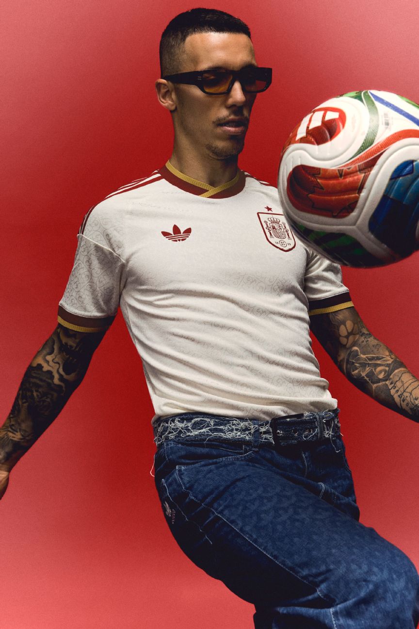
An opulent mix of colors sees Spain furnished with a rich cream retro-style away kit that is decorated with maroon and faded gold trim. There is also an ornate coiled vine pattern in the fabric that is inspired by the gold-leaf illuminations that adorn many ancient Spanish literary manuscripts — and it looks even better when the retro number set is applied to the chest and back.
Rating: 7.5/10
In essence, Sweden have been foisted with yet another predictable blue and yellow color swap away kit, but the fine details help elevate the 2026 model above the morass. Deep glacial blues and faded yellows are joined by a smart 1970s-style Scandi ripple pattern that forms vertical stripes along the length of the torso. Nice.
Rating: 7/10
Ukraine are still fighting to reach the World Cup, but they will look good trying. This jersey boasts a rich blue and yellow that comes with an elaborate chest plate graphic inspired by the “Tryzub” crest (a blue shield with a golden trident) found on the Ukrainian national coat of arms. Take note of that fantastic collar, too.
Rating: 6.5/10
The only other away kit to feature a three-color trefoil, Venezuela’s version comes in the national colors of yellow, blue and red. Those are then used on the unusual wordmark crest that adorns the shirt, rather than the VFV’s modern shield-shaped logo. Retro minimalism done well.
Rating: 7/10
This one is a white shirt with faint yellow dragon graphic inspired by Y Ddraig Aur (“The Golden Dragon”), the royal banner of Welsh hero Owain Glyndŵr and a symbol of national union and pride. The tricolor trim then adds an extra patriotic flourish to the mix.
Rating: 6.5/10